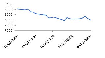
Line chart
The line chart is the simplest chart. The Y-axis represents time whereas the X-Axis displays the price. We can plot the position of the market per minute, hour, 15 minutes, daily, or a weekly bases. This kind of chart only shows the closing price over a period of time. A line chart does not provide additional information such as high, low, and opening price. The greatest benefit to the analyst of a line chart is its simplicity and the ability to understand price movements very easily. A line chart also depicts trends by simply viewing its slope.
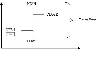
Bar chart
The Bar chart uses vertical bars to display price action for a particular day with the help of a line from the lowest to the highest price as shown below. The bar represents the day’s high, low, and closing price. Bar charts allow traders to see patterns easily. The bar chart is a set of four prices for a given day, hence it is also referred to as a price bar.
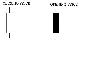
Candlesticks
The candle stick chart is similar to a bar chart but differs in the way that it is visually constructed. The chart is plotted over a one day, weekly, as well as monthly period as it gives a detailed picture of longer time price action. The chart displays a thick body called the real body and a line extending above and below called the upper and the lower shadow. The top of the upper shadow represents the high price and the bottom of the lower shadow represents the low price. The opening and closing values depend on the color of the chart. If the color of the chart is black, it means the top is the opening value, and if it is white then the top represents the closing value. The white body of the chart indicates bullishness and the black body represents bearishness.
Point and figure chart This type of chart is rarely used in forex analysis. This chart plots day to day increases and declines in the price of a currency vis-à-vis another currency. A rising X represents increase in currency value whereas a declining O represents decrease in the currency value. This kind of chart is typically used by the traders for intraday charting and estimation.
Three Line break chart
This chart displays a series of vertical boxes that reflect changes in currency prices. The method is so named because of the number of lines typically used. Each line may indicate buy, sell, and trend of the market. The basic application of this method is to buy when a white line appears after three adjacent black lines and sell when a black line appears after three adjacent white lines.
Conclusion: There are various charts for technical analysis out there, although the most commonly used charts are candlesticks, line charts, and bar charts. Each comes with its advantages and drawbacks, although each chart can be used as the result of personal preference or perceived accuracy.


No comments:
Post a Comment